Case Study
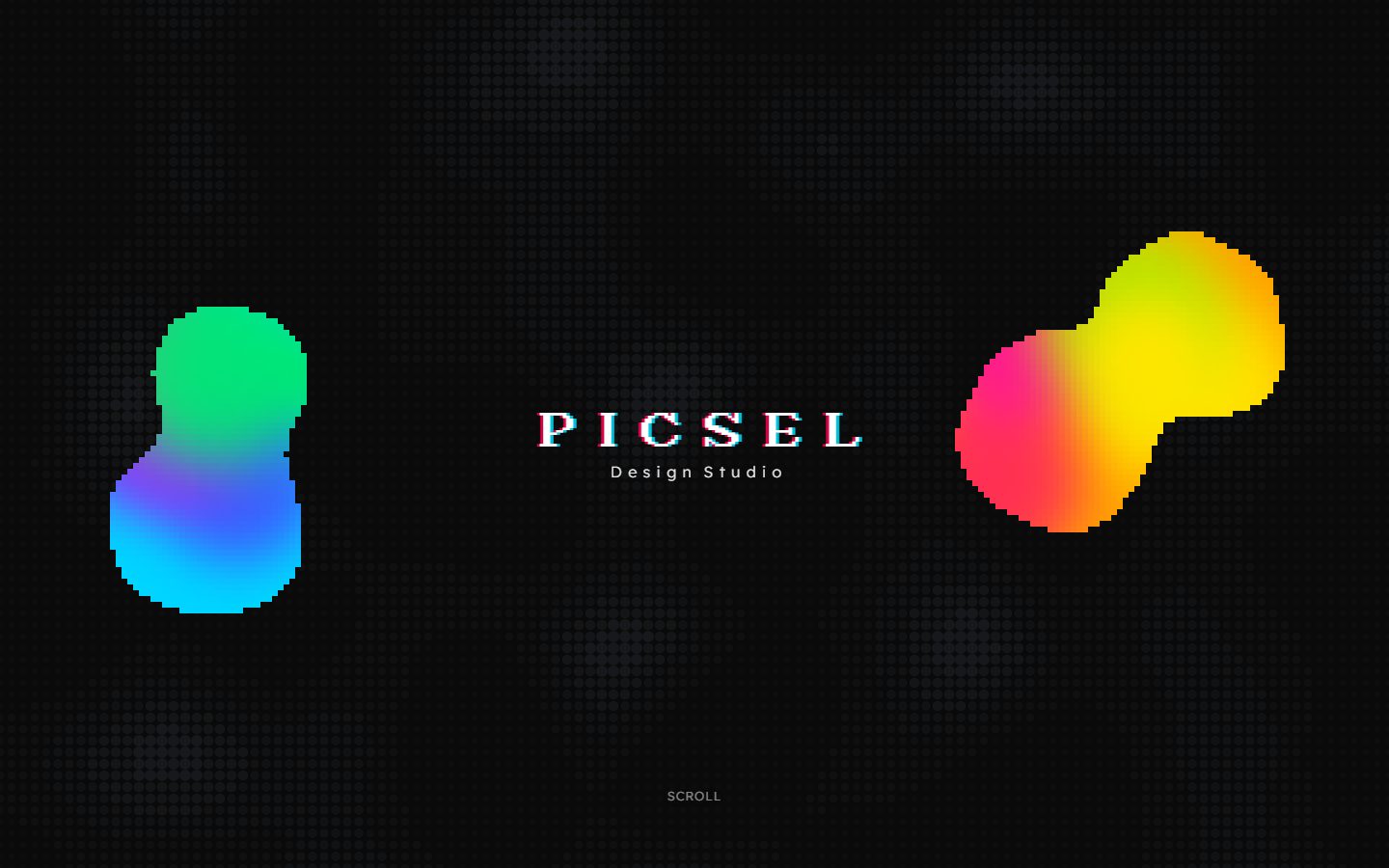
Picsel Design Studio
A web design and automation studio, built and run by one person. Five client sites are live on it.

01
What it is
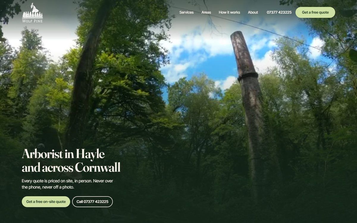
Picsel builds websites for small businesses, mostly trades, and the automation that runs around them. I founded it and run it on my own: strategy, design, build, copy, sales and ops. Five client sites are live. Most go from brief to launch inside a week: AJC Removals took four days, A Nevitt Construction five, Wolf Pine and Lanora House about a week each.
Small trades businesses either have no website or a bad one, and the agencies that serve them charge thousands for something templated. The gap is a site that is genuinely cheap to buy and genuinely good, which only works if the build cost is engineered down without the quality going with it. A written standard, a studio site, a dashboard and an automated mockup pipeline are all answers to that one constraint.
The pipeline is the clearest measure of it. A speculative site for a prospect takes 8 to 15 minutes to build now. By hand it was an hour or two, which is why nobody in this market gives them away.
02
Client work
Five sites, all live, all built against the standard below. Three have their own case studies here. Every one of them was designed, built, written and launched by one person.
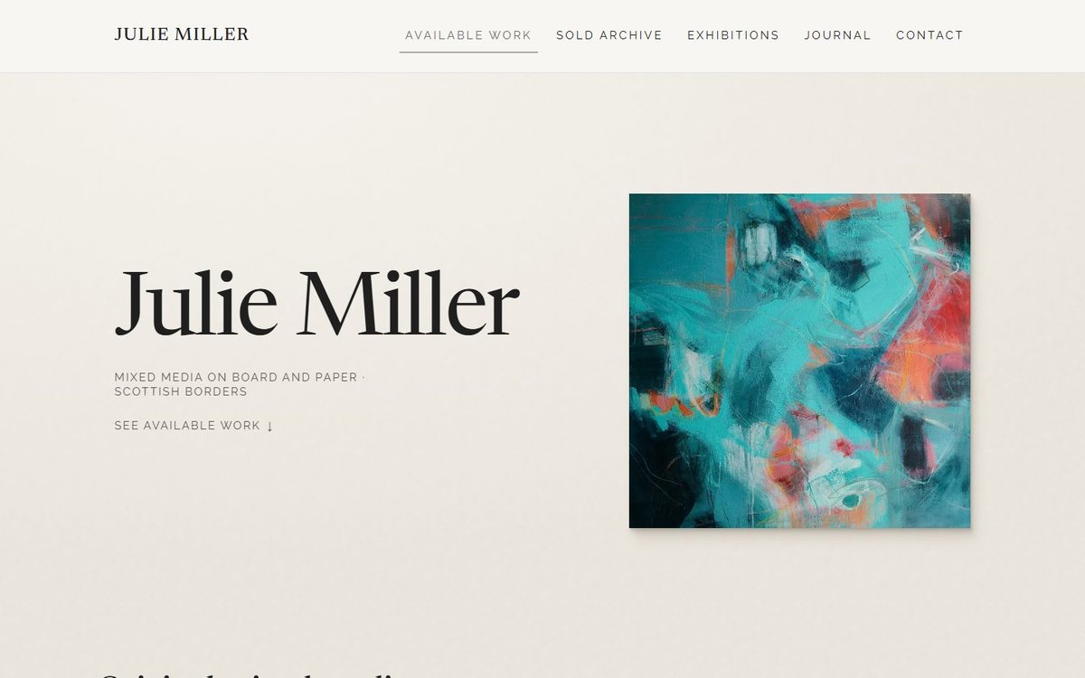
Julie Miller Art
A gallery site with a studio admin behind it, so the artist publishes her own work. A day to build, two more to add the admin.
Case study · juliemillerart.co.uk
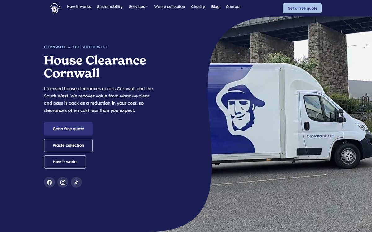
Lanora House
House clearances across Cornwall, with waste collection and a monthly charity giving scheme. About a week to build, and updated steadily for a year since.
Case study · lanorahouse.com
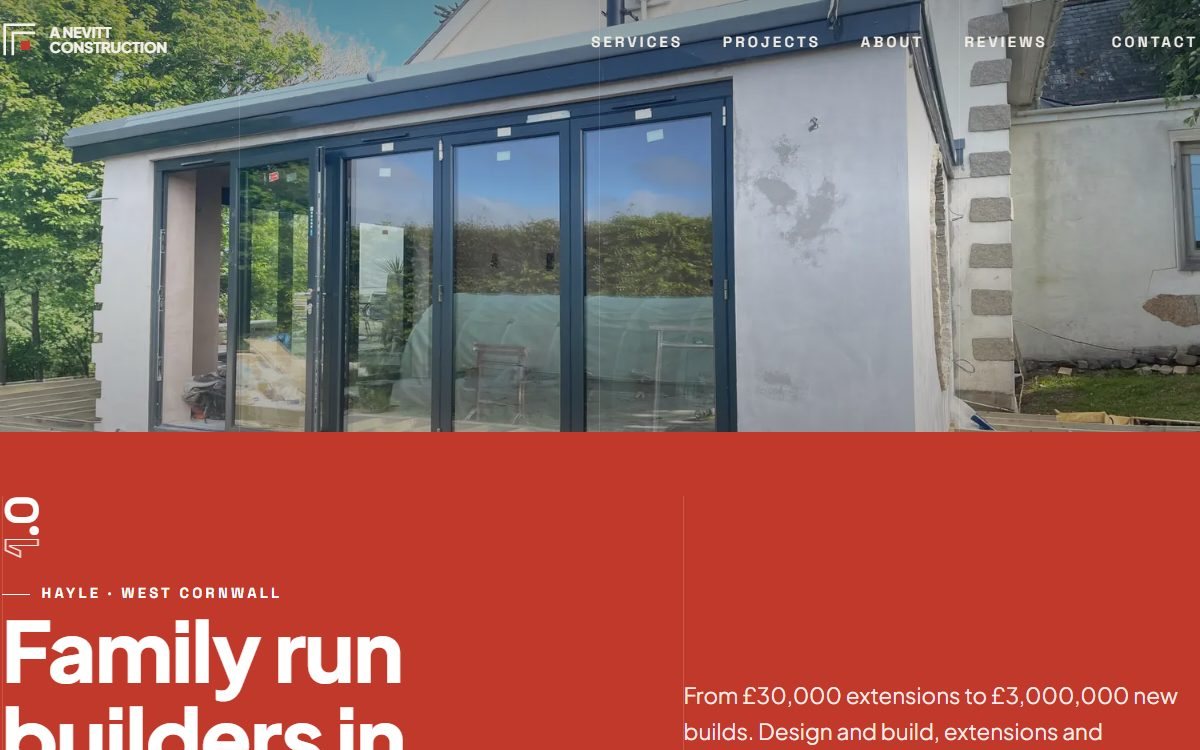
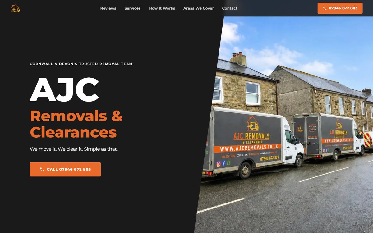
Five live sites, none of which took longer than a week to get in front of customers. The speed is the point: it is what lets the price be low without the build being thin.
03
The Picsel Design Standard
A written rulebook every Picsel site is built against, so quality does not depend on how much time a build happens to get. It has a floor: spacing, type scale, hierarchy, colour, contrast and performance, each with a number attached so it can be checked rather than argued about. It also has a ceiling, which is art direction and one committed idea per site. A competent site nobody remembers is a failed site at this end of the market, so the ceiling matters as much as the floor. Three rules sit above both.
- The client wins: their brand and their references beat my preferences.
- Familiar layout, distinctive execution: the structure stays conventional, the treatment carries the interest.
- Defend it or delete it: if I cannot say why an element is there, it does not ship.
The second rule is the one with research behind it. Aesthetic judgements form in tens of milliseconds, and that first impression is driven largely by low visual complexity and by layouts people already recognise. So the skeleton of a Picsel site is deliberately ordinary, and the interest goes into the treatment on top of it.
Written rules are why a build can be quoted in days rather than guessed at. The floor is checkable, so finishing a site is a pass or a fail rather than an argument with myself at midnight.
04
The Work ring
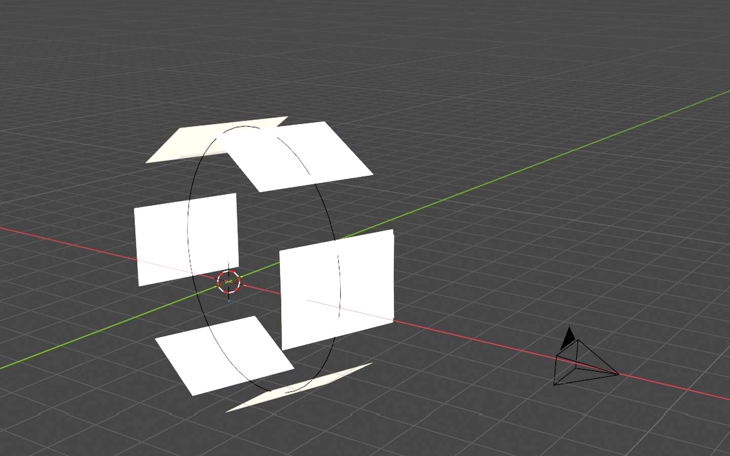
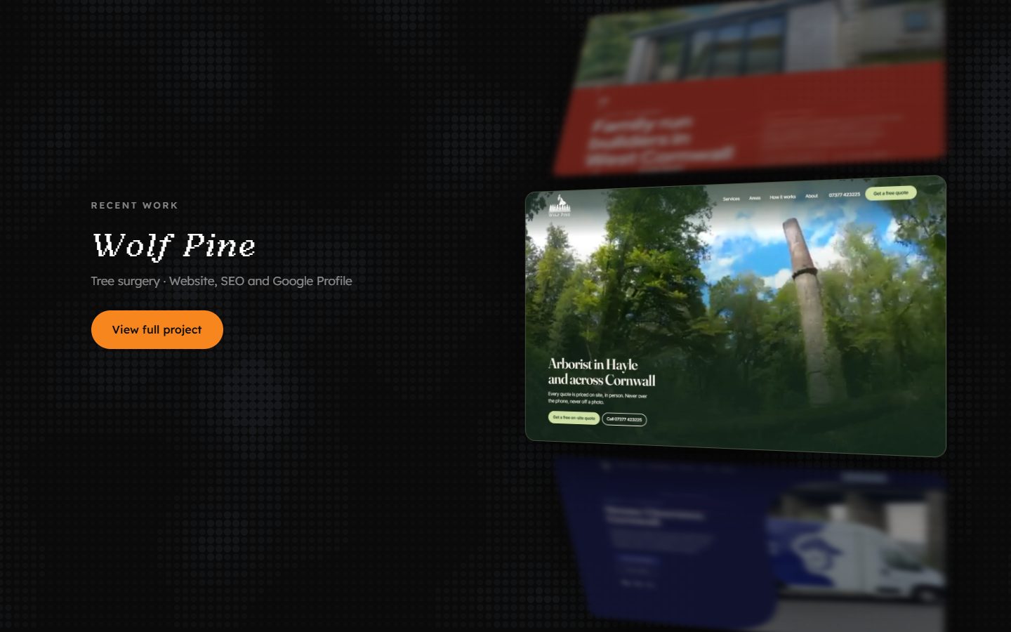
The featured projects on picsel.co.uk sit on a 3D wheel that turns one project per scroll. I modelled the geometry in Blender first to settle the radius, the spacing and where the camera sits, then rebuilt it in CSS 3D transforms and vanilla JavaScript. No animation library. Scroll the frame at the top of this page to see it turn.
Why it behaves the way it does
- Sticky, not hijacked: the section pins rather than intercepting scroll, so native scrolling, trackpads, touch and the scrollbar all keep working.
- Blur set once per turn: the depth blur is written on each turn rather than every frame, so it does not stutter on mid-range phones.
- HTML first: every project and link is plain markup underneath. The ring is a layer JavaScript adds on top, and the page still works without it.
- Reduced motion:
prefers-reduced-motionfalls back to a plain grid. - Keyboard: arrow keys turn the wheel, and tabbing to an offscreen project scrolls it into view.
The studio site gets one committed idea, and it costs nothing a client would pay for: no animation library, no hijacked scroll, and a plain grid for anyone whose browser asks for less motion.
05
The tooling behind it
Two private apps do the work that would otherwise eat the margin: one to run the business from a phone, one to build speculative sites for prospects without opening a code folder.
Picsel HQ, the private dashboard
One web app the whole business runs from: clients, the recurring care work due this month, projects in build, the leads pipeline and targets. Static HTML, CSS and JavaScript with Supabase for data and login, installable as a PWA, designed at 375px first, never indexed and never publicly linked.
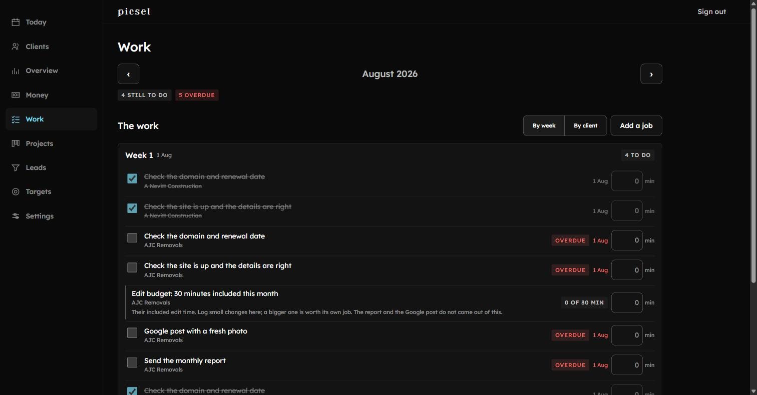
- The month, with what is still to do and what is overdue. This is the first screen of the day.
- Every care job carries the client it belongs to, so a month of work is one list rather than five.
- Included edit time is tracked in minutes against the client, which is how a small plan stays small.
The one integration worth naming: a client site can report contact intent back to HQ — taps on a phone number, completed enquiry forms. Give a client a reporting key, paste it into their site, and their record starts answering the only question a client ever really asks.

The mockup pipeline
Pick a template, enter what is known about the business, let an agent gather the rest and their photos, review the facts, press build, and end with a live preview link ready to send. It runs headless Claude Code in GitHub Actions, so my laptop does not need to be open for a build to happen. Two rules hold it together. Nothing is ever invented: every fact on a mockup carries its source. And gathering is separated from building by a review gate I have to pass myself, which is the step the first version tried to automate and got wrong.
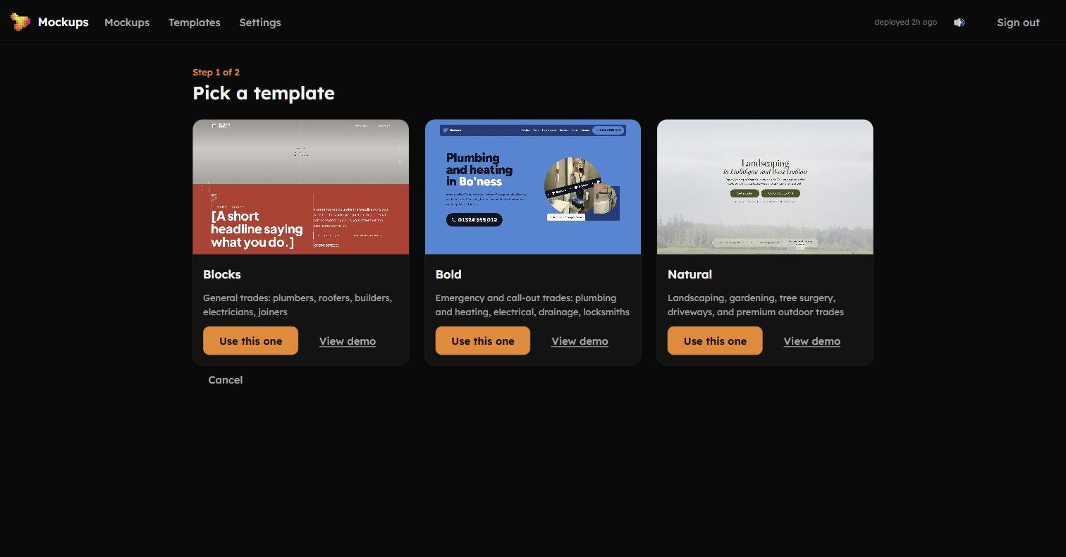
- Two steps to a live mockup. This is the first, and it is the only design decision left to make.
- Each template names the trades it suits, so picking one is a question about the business rather than about taste.
- Every template has a working demo, because a thumbnail cannot tell you whether a layout holds up.
HQ means the whole business is runnable from a phone between jobs. The pipeline turned a one-to-two hour speculative build into 8 to 15 minutes, which is what makes handing a prospect a real site to look at possible at all.
06
What I would do differently
The design standard was written after the first builds rather than before them. Early sites had to be retrofitted to rules they were never built against, which took longer than writing the rules first would have.
The mockup pipeline was rebuilt once. The first version tried to automate the review step, which is exactly the step that most needed a human, because it is where an unsourced fact gets caught. The rebuild put a person back in the middle on purpose.
Next step
The studio site is the best version of all of this, and it is one click from here. If you have a business that needs one, or you want the detail behind any of the builds above, get in touch.