Case Study
Lanora House
Brand, website and livery for a Cornish house clearance company. Built in a week, and redrawn since as the business grew into a wrapped Luton and a second brand for its buyers.
01
The brief
Lanora House clears houses across Cornwall and the South West, then sells on what it saves. It needed an identity that could stand at a stranger’s front door and on the side of a Luton van, and a website aimed squarely at the person holding the keys.
Clearance work is bought on trust, not on price. Somebody is deciding whether to let a stranger into a house they have just inherited, usually at a week nobody enjoys. Everything on the site is built for that person: what happens, who turns up, what it costs, and how quickly it can be done.
Buyers are a different job with a different tone, and putting both on one site would have blunted it. So the buying audience was given a brand and a channel of its own rather than a second column here — that work is written up in House of Cornwall.
- Role: Brand and web designer — identity, website, livery, print, ongoing development
- Deliverables: Logo suite, brand identity, website, van wrap, posters and signage
02
The identity
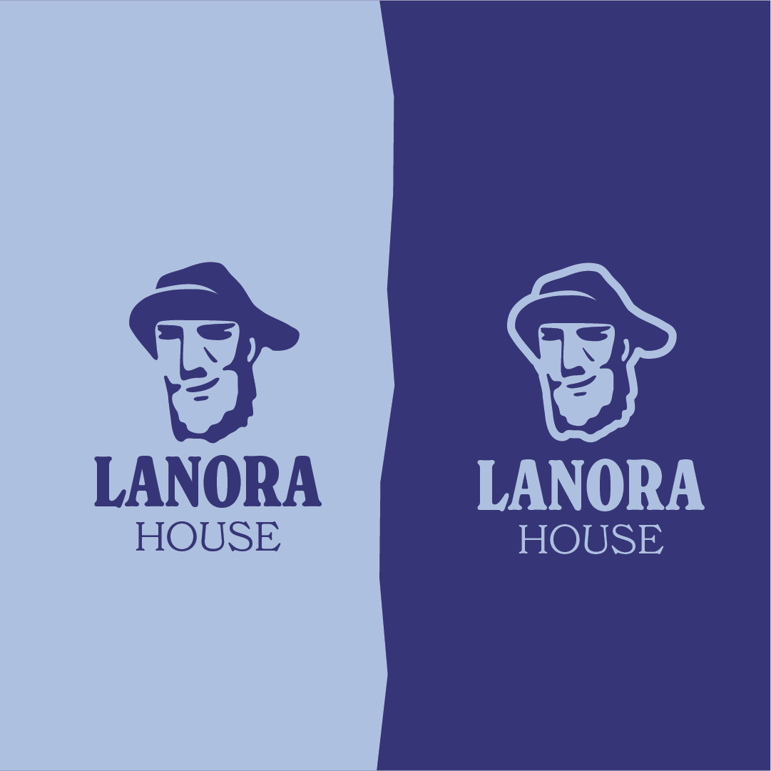
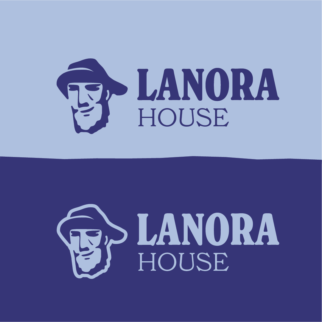
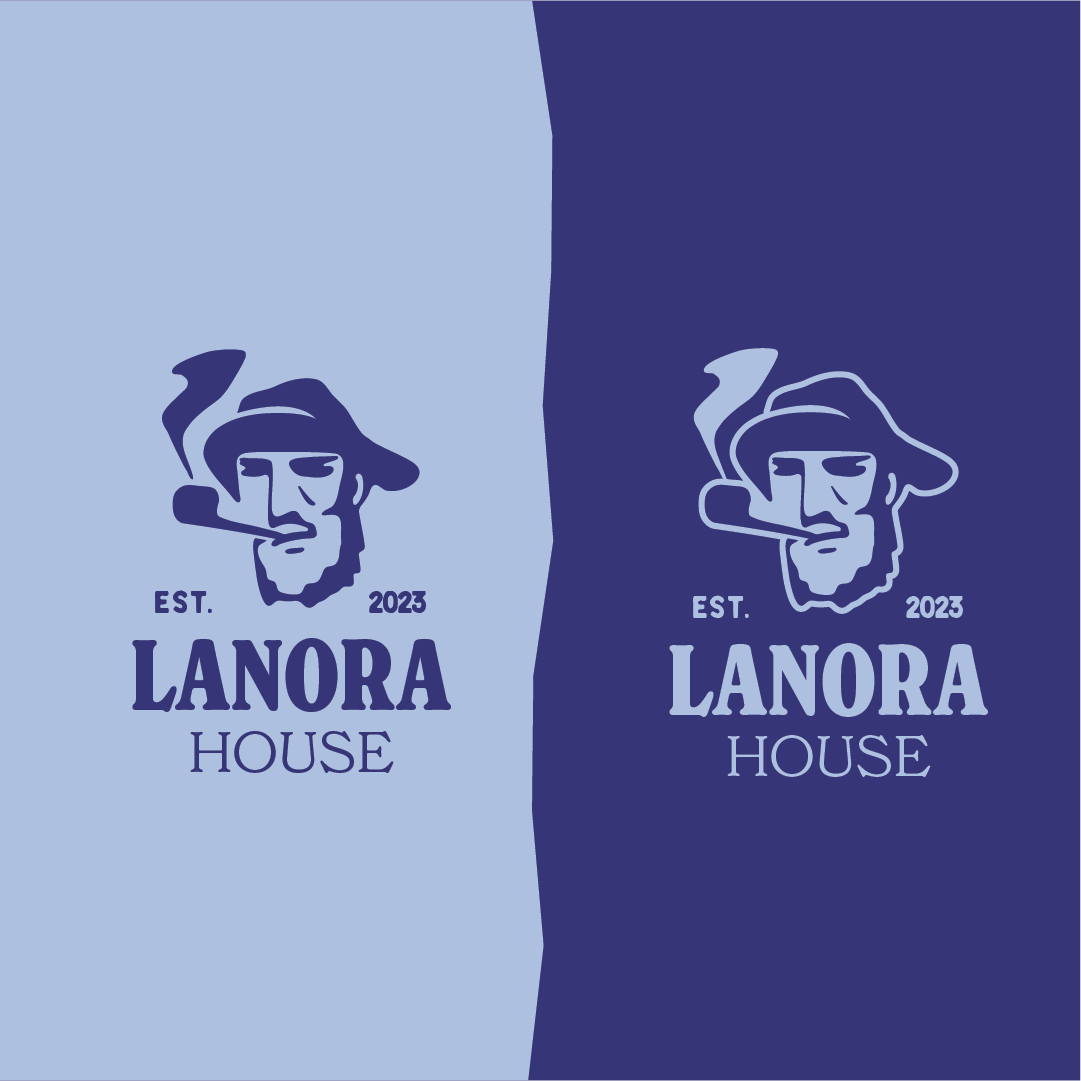
The mark is a Cornish fisherman under a wide brim, drawn from the harbour town the business works out of. It reads as somebody who has been doing this a long time, which is the whole point: the brand had to look established before the company was.
The first version gave him a pipe and a hard stare, and it was the wrong first impression. This is a business that turns up at the door of a house somebody has just inherited — the face on the van should not look like it wants the job over with. The redraw takes the pipe out and lifts the mouth into the beginning of a smile. Same man, same weathered lines, but he now reads as approachable rather than unimpressed, and as a company rather than a character.
Dropping the pipe also took a plume of smoke out of the silhouette, so the mark holds together at the sizes it actually gets used at. It comes as a vertical lockup and a horizontal one, works on light and dark, and stands alone as a logomark for a profile picture or a van door.
03
The website
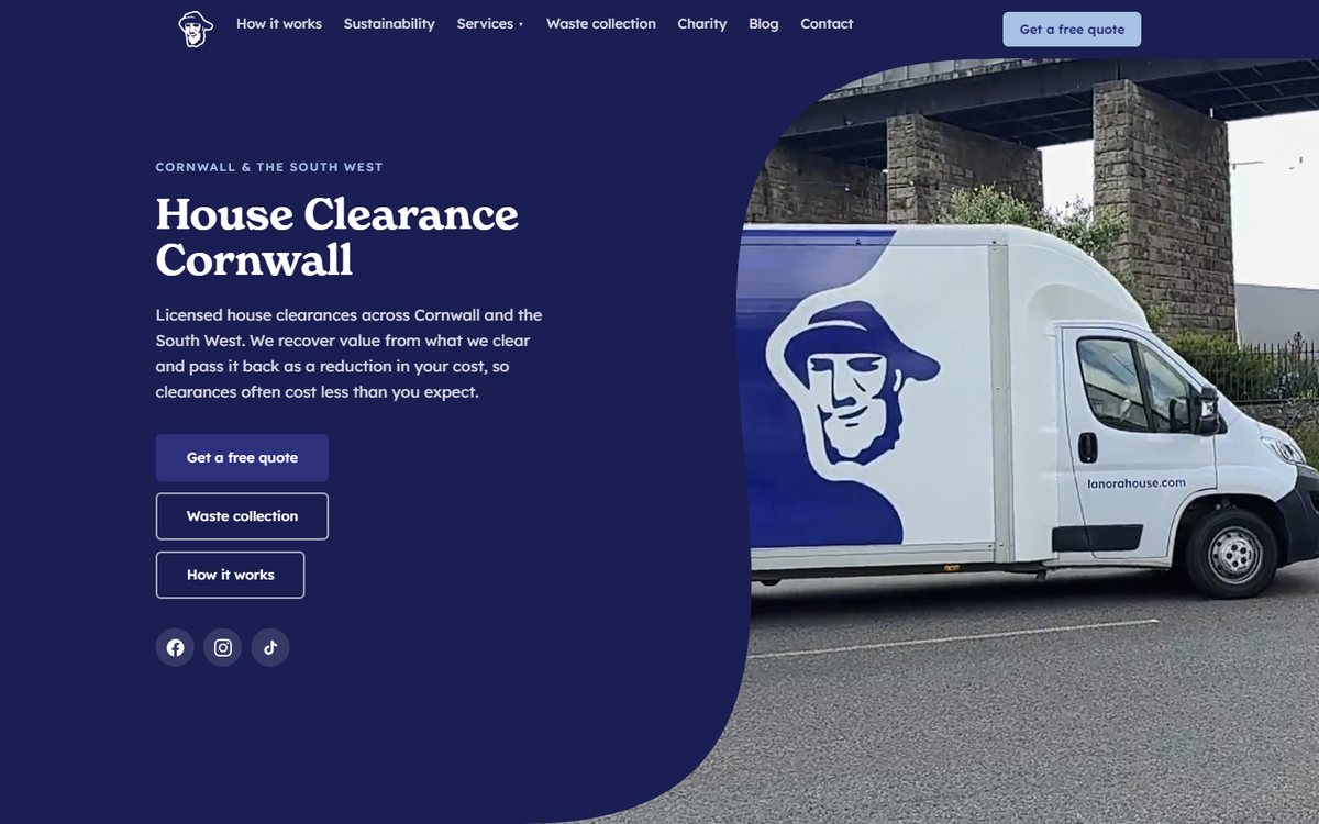
One visitor, one job. Someone is holding a set of keys to a house that needs emptying, and they want a phone number, a price they can believe and a sense of who is going to turn up. The site leads with reassurance and one call to action, and every page ends back at the same place.
The rest answers the questions that come next: how a clearance actually works, what happens to what is cleared, waste collection, and the charity side. Value recovered from the contents comes off the bill, so that is said plainly rather than buried — it is the reason a clearance often costs less than people expect. It was built custom, on one set of components and one visual language.
A week to the first version, and a year of steady additions since. The parts that were designed as components are the reason new sections keep costing hours rather than rebuilds.
04
On the road
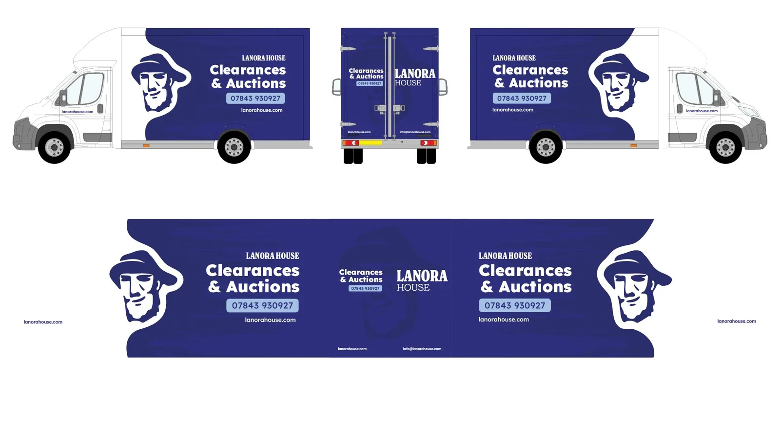
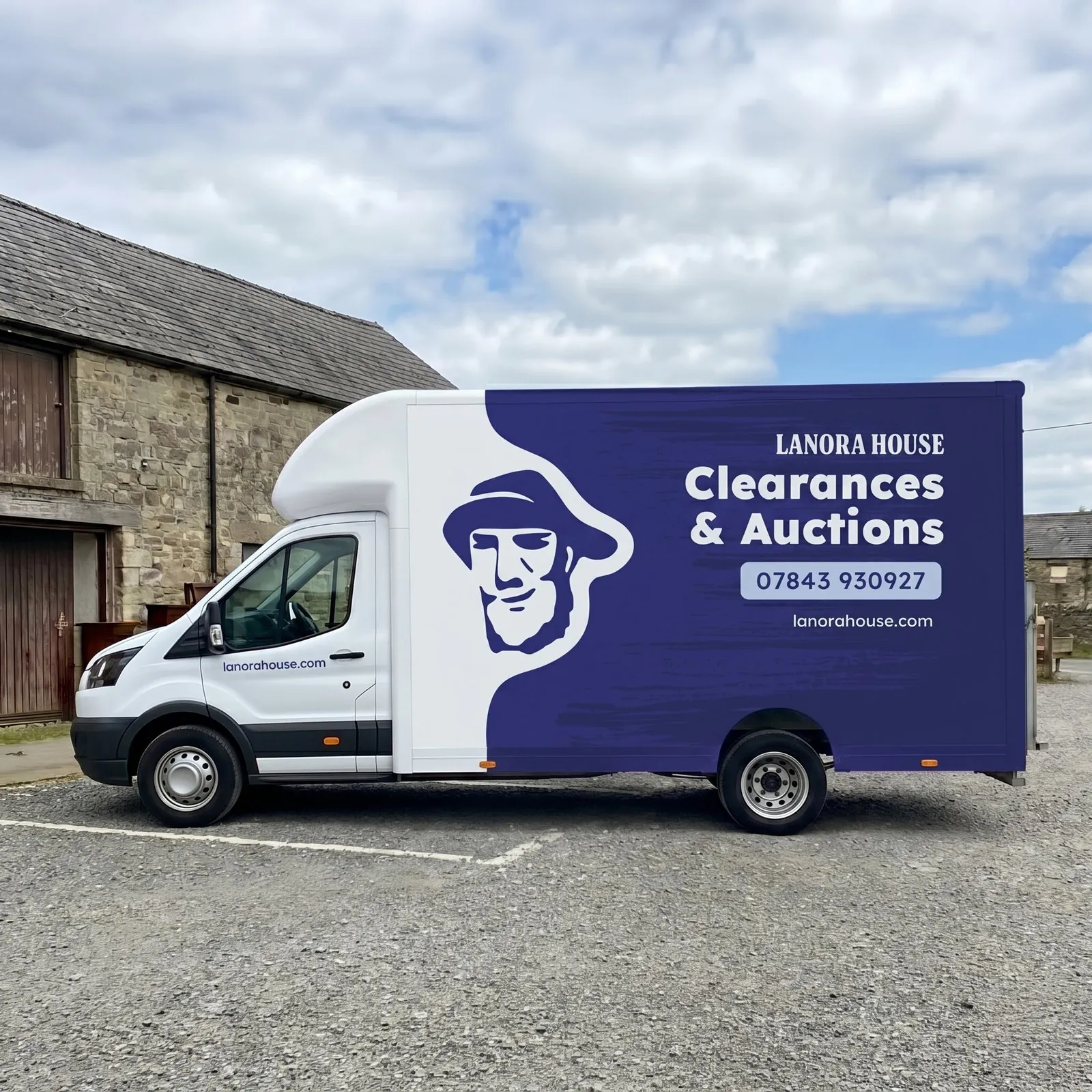
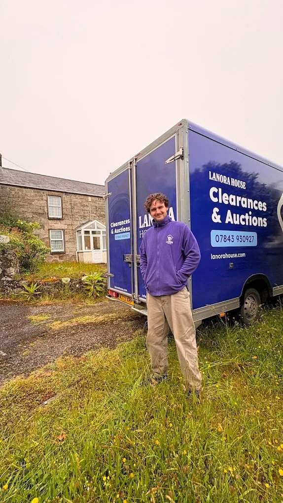
The Luton is the biggest thing the brand owns, and it spends its day parked outside the exact houses the business wants to be called about. It is an advert that only gets one second of attention from a moving car, so it says one thing: what they do, and how to ring them.
The fisherman is cropped hard and blown up to fill the box, breaking the white cab into the navy on a torn edge so the van reads as one shape rather than a sticker on a panel. Everything else is three lines of type on the largest clear area, with the number in a pill so it survives a glance. Drawn across all four faces so it works whichever side you meet it on.
05
Print & signage
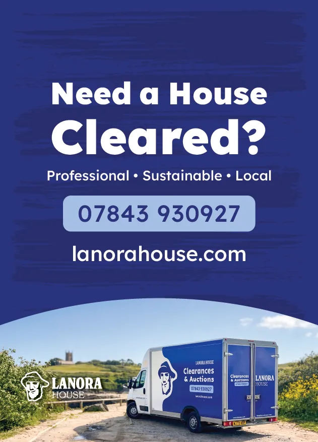
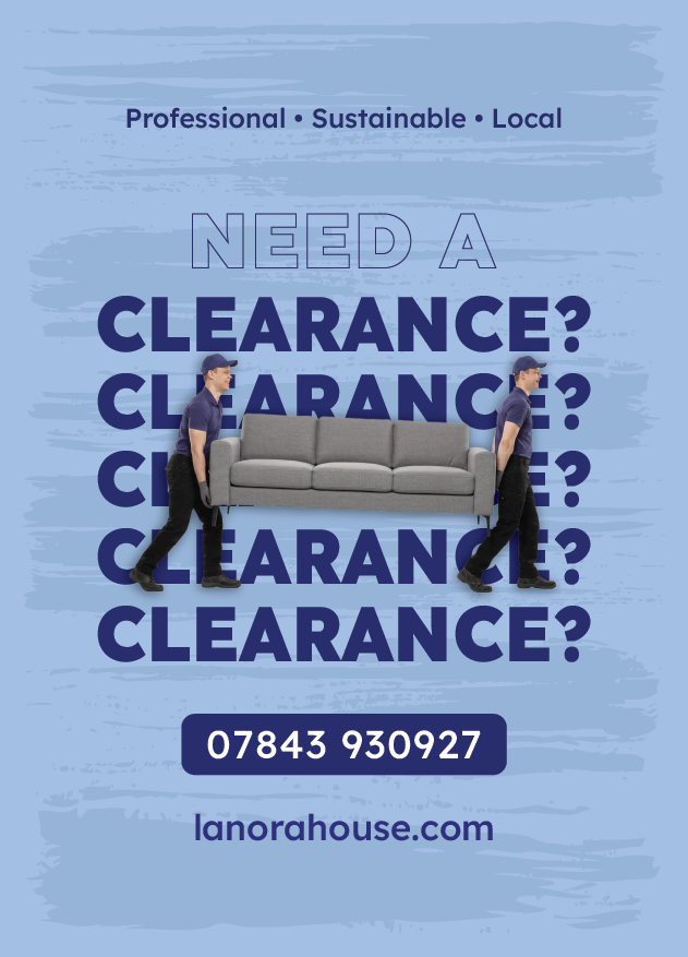
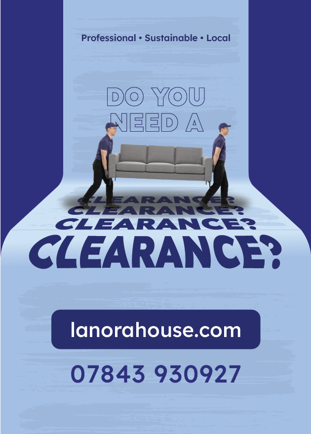
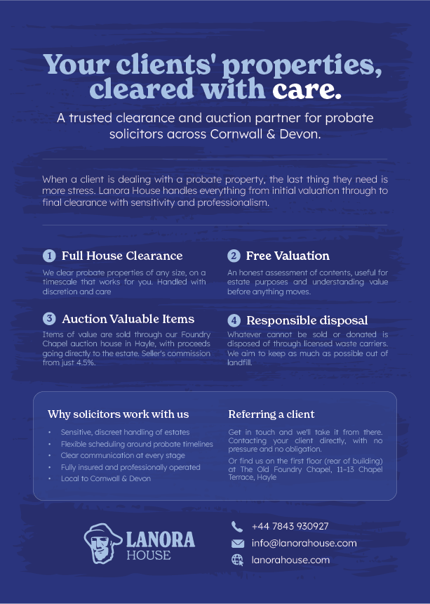
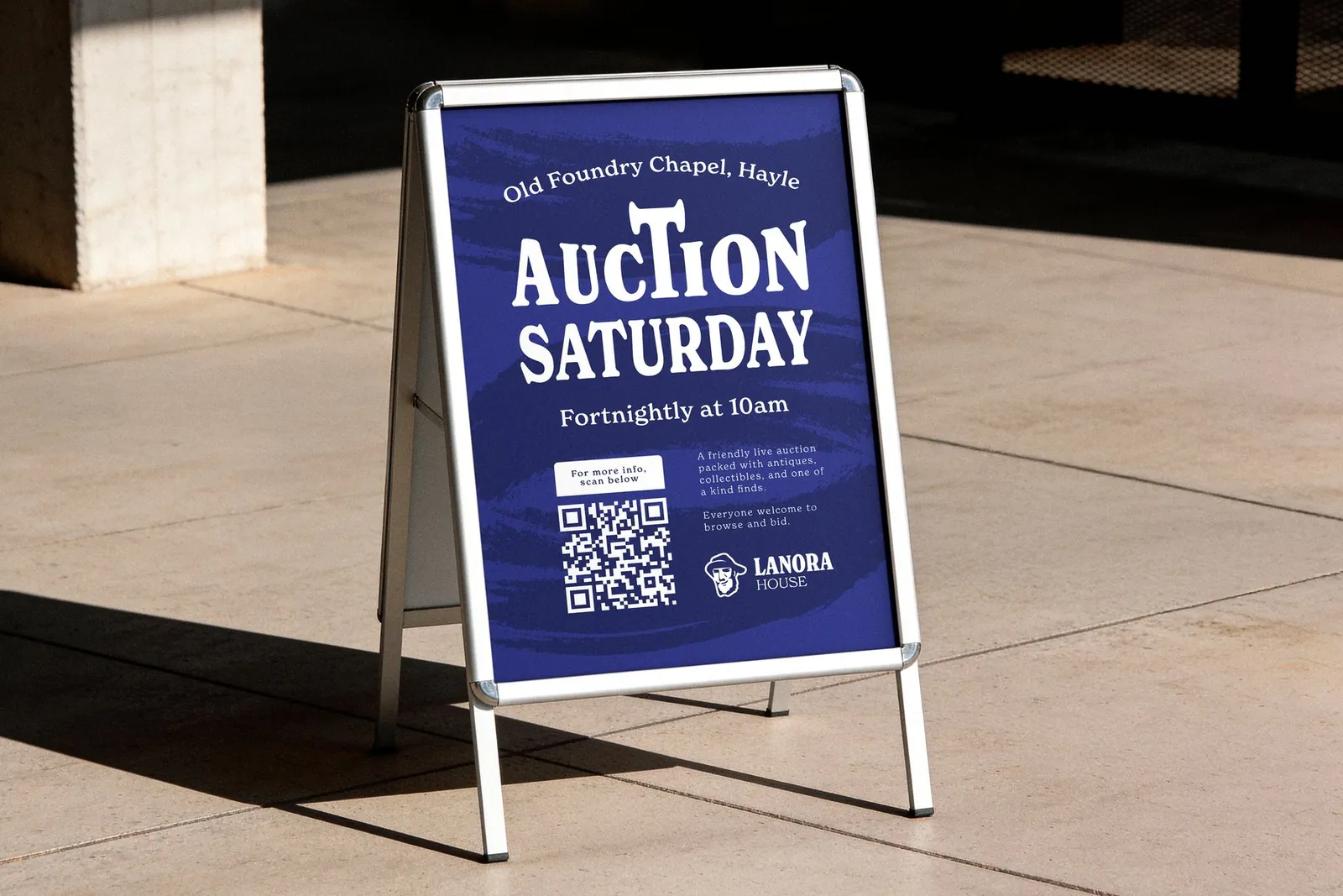
Most of this business is still won locally, on paper. The print set covers the three ways that happens: posters for the clearance side, an A-board outside the saleroom, and a flyer aimed at probate solicitors.
The clearance posters run the same offer three ways rather than settling on one, so the message can be matched to where it hangs. The A-board has to be read from a pavement at walking pace, so it carries the date, the time and a QR code and very little else. The solicitor flyer is the opposite problem — it is read at a desk, so it can afford four numbered steps and the commission rate in full.
Outcome
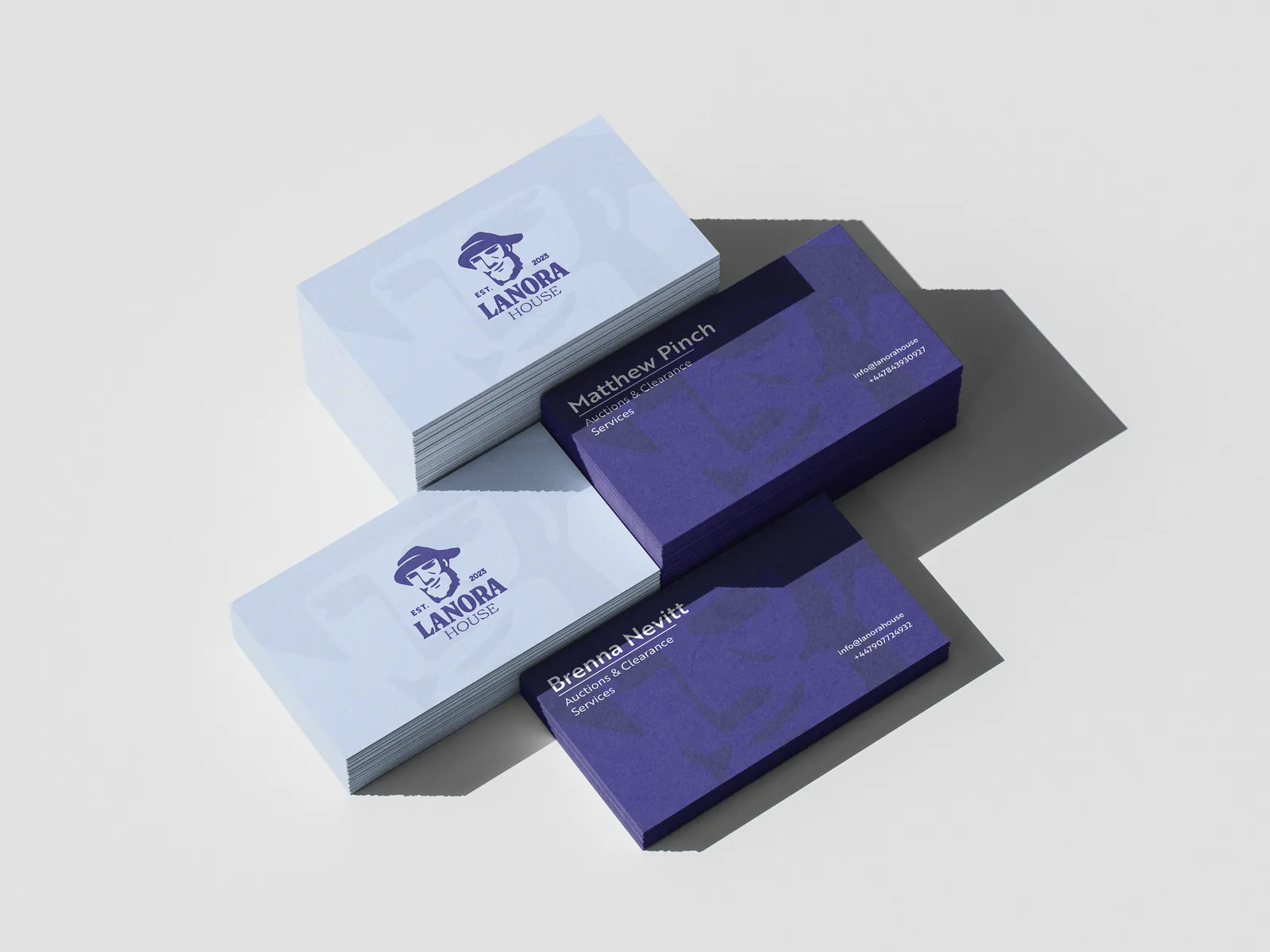
Lanora House reads as an established firm rather than a man with a van, which is most of the job when the work arrives by referral. The identity now runs from a business card to the side of a Luton, and the site has grown with the business rather than been rebuilt around it. It was the project that proved a brand and a build could come from the same hands without either being an afterthought, which is the model Picsel was built on.