Case Study
House of Cornwall
A clearance business had two audiences pulling its brand in opposite directions. This is the one built for the buyers: a crest, a live channel and a page that does one job.
01
Two audiences, one business
A house clearance company deals with two sorts of people who have nothing in common. One has inherited a house and needs it emptied. The other wants to buy what comes out of it. Ask one brand to talk to both and it ends up doing neither well.
So the buying side was given a brand of its own. House of Cornwall sells clearance stock live on eBay, every week, out of Hayle in Cornwall. That let the clearance business stay pointed at the person holding the keys, and gave buyers somewhere built for them: a show to turn up to rather than a services page to read.
- Role: Brand designer and developer — identity, landing page, social and stream graphics
- Deliverables: Crest and wordmark, colour and type system, landing page, weekly social kit, channel artwork
02
The crest
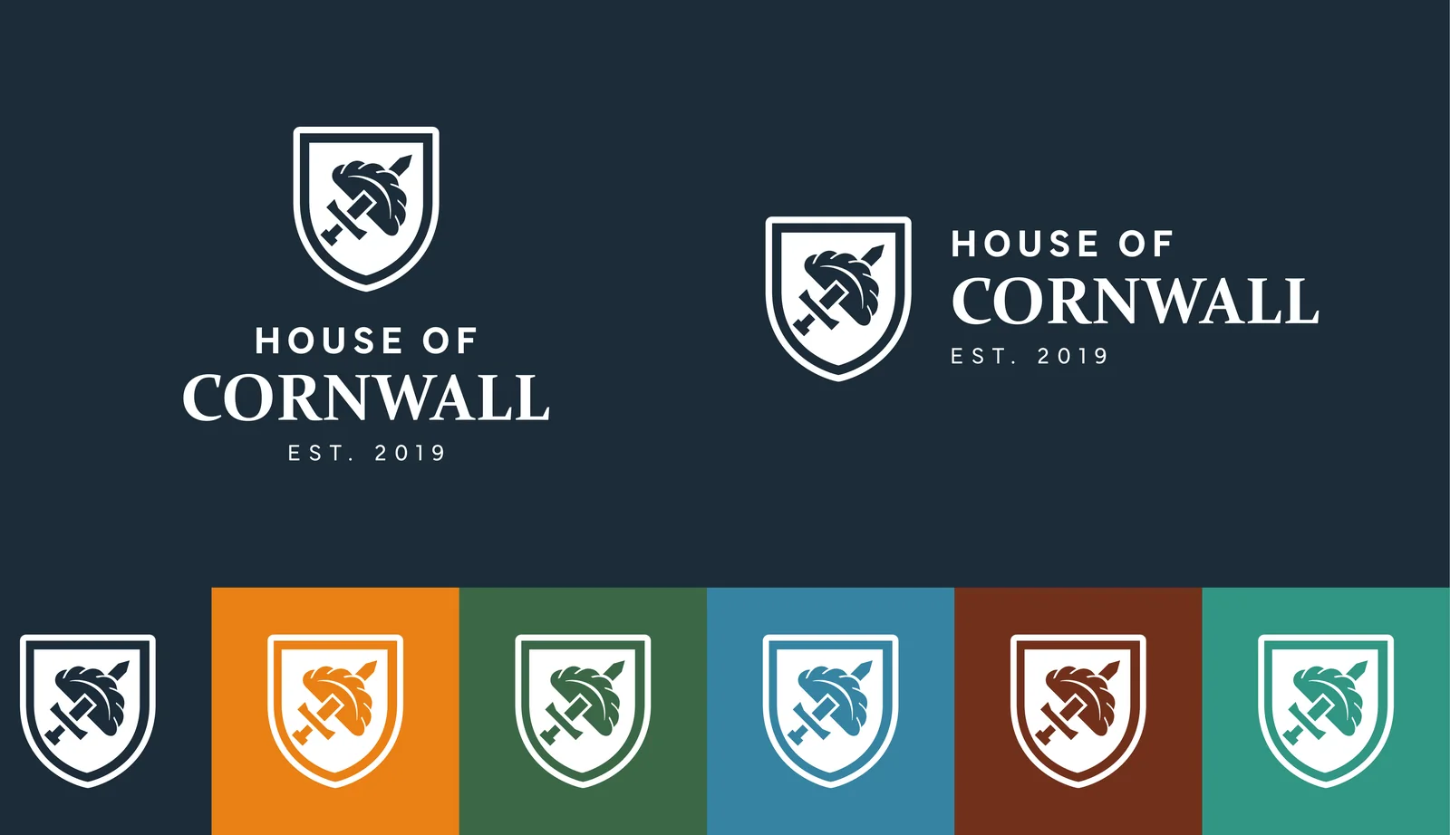
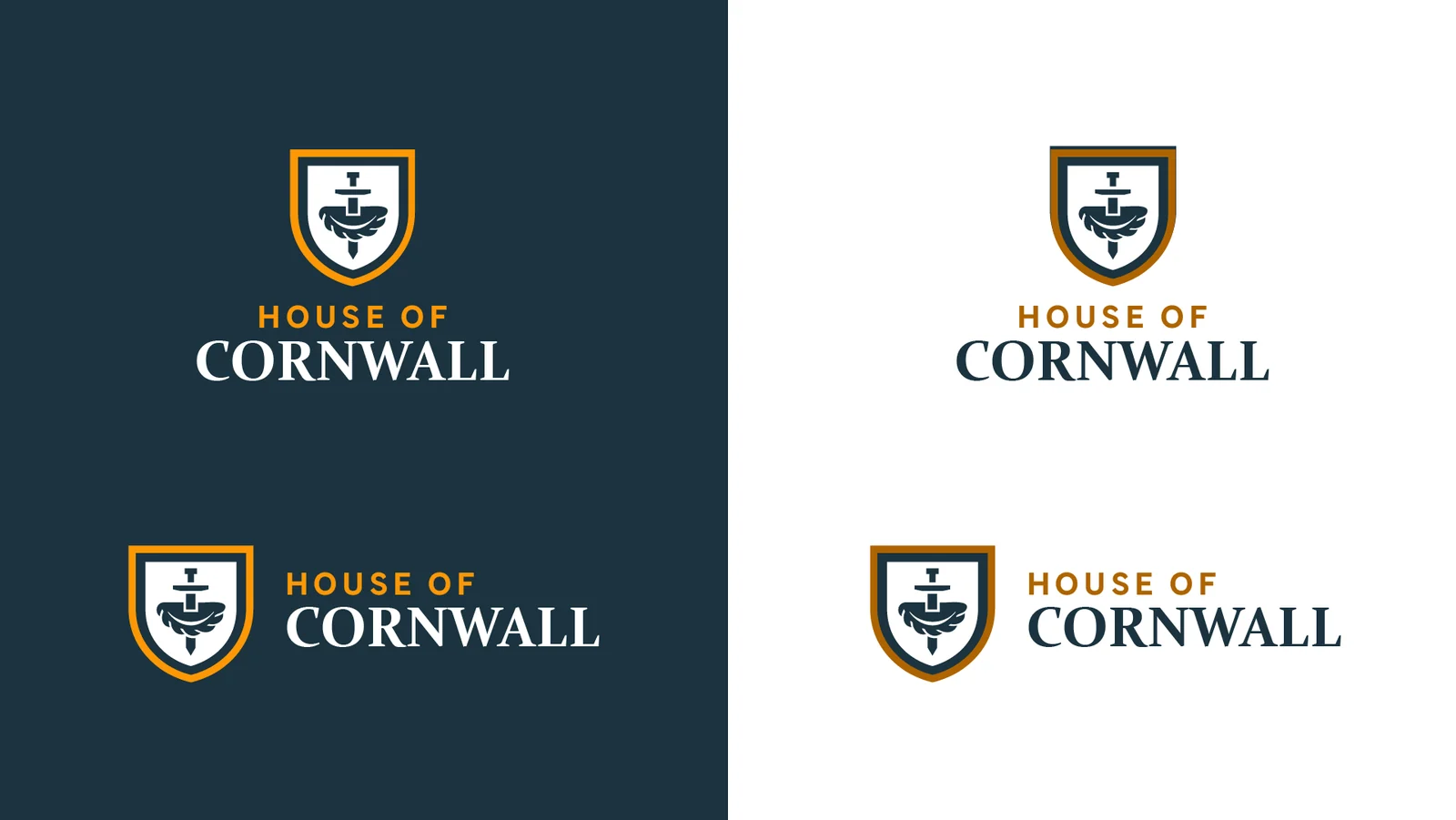
The mark is a shield with a sword driven through a Cornish pasty. It looks like a coat of arms until you notice what the sword has gone through. It had to survive being an eBay profile picture at 60 pixels and a printed sticker on a parcel, so it is drawn as flat shapes with one gold outline holding the silhouette together. It took a few rounds to get there. The shield, the pasty and the sword were each drawn out and tried against one another before the crest settled.
Navy and gold came out of the channel's own cover art rather than a palette chosen in the abstract, so the brand and the thing people actually see on screen match. The container wall behind the type is the same corrugation the stock arrives in, which gives every post a background that belongs to the business rather than a stock texture.

03
A page with one job
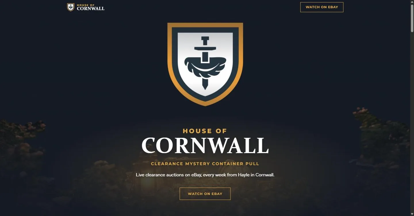
The site is one page and it answers three questions: what this is, when it is on, and where to watch. Everything else would be in the way. It is plain HTML, CSS and JavaScript with no build step and no database, hosted as static files, which is why it costs almost nothing to keep up.
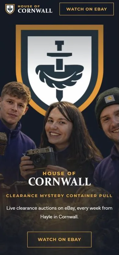
The hero is the channel's cover art taken apart. Background, the three sellers and the crest are exported as separate layers and stacked in the browser, then faded in one after another on load. The title is not part of the image: it is HTML type, so it stays sharp at any size and can be read by a search engine. The colours in the CSS are sampled from that same artwork.
04
On the Road
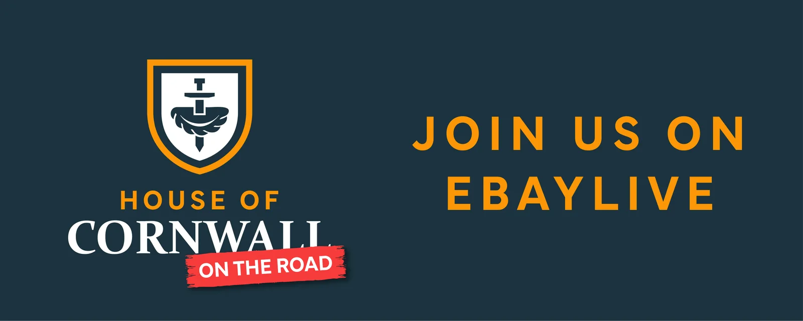
The channel does not only sell from Cornwall. On the Road takes the live sale to wherever the stock is, anywhere in the country, and it needed a device of its own that could sit on a post without becoming a second logo. It is a torn red band with the name inside it: loud, temporary, obviously a stamp on top of the brand rather than a replacement for it.
05
The weekly kit
A live channel eats graphics. Every show needs announcing, every week needs a date, every platform wants a different shape. So the identity was built as a kit rather than a set of one-off posts: a going-live announcement, a dated as-seen-on-screen slot, banners sized for eBay, Facebook and Discord, and listing thumbnails that carry the crest.
All of it comes from the same three parts, which is the point. Gold type, container navy, the crest. Someone can put next week's date into a template and it still looks like the channel.




Outcome
House of Cornwall is live at houseofcornwall.live and broadcasting weekly. Splitting the buyers out into their own brand is what let the clearance side stay simple: that site now speaks only to the person with a house to empty, which is the job it does best.
The clearance business it grew out of is written up separately — read the Lanora House case study.