Case Study
Harbor & Co.
Conceptual brand design and experience for a harbour-side coffee and wine bar.
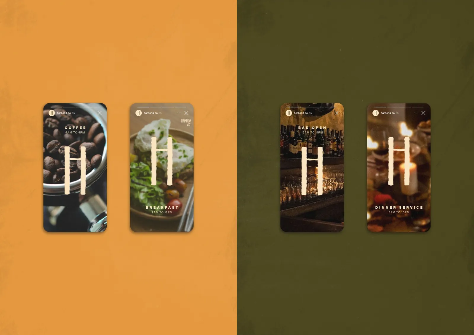
Project Overview
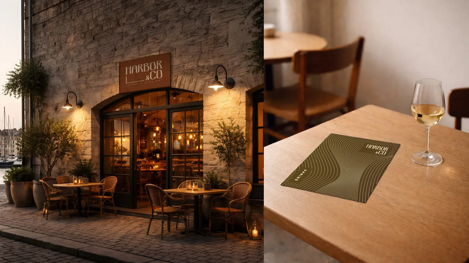
Harbor & Co. is an independent coffee and wine bar opening in a converted harbour-side warehouse. The space operates as a café during the day and transitions into a relaxed wine bar in the evening.
The founders want a brand identity that feels quietly confident, considered, and timeless, avoiding anything overly trendy or decorative. It should appeal to a design-aware audience without feeling exclusive or pretentious, and it must feel at home both on a printed wine list and in a minimal digital environment.
01
Project Brief
Client
Harbor & Co.
Industry
Independent specialty coffee & wine bar
Location
Coastal European city, old harbour district
Timeline
1 week, start to final delivery
Overview
Harbor & Co. is a conceptual identity project for a harbour-side coffee and wine bar operating as a café by day and a wine bar by night. The brief was to explore how restraint, typography, and spacing could be used to create an identity that feels established without being overly expressive or decorative. The resulting system is editorial in tone, using warm neutral colours, clear hierarchy, and structured layouts to reflect the atmosphere of a quiet coastal port town.
Objectives, Audience & Personality
Objectives
- Create a cohesive brand identity for launch
- Establish a strong typographic-led system
- Balance warmth with restraint
- Ensure the identity works across print and digital
- Create a brand that can scale over time
Target Audience
- 25–45 year olds
- Design-conscious professionals
- Locals and visitors who value quality & atmosphere
- Customers who appreciate independent brands
- People drawn to calm, well-considered spaces
Brand Personality
- Quiet
- Confident
- Thoughtful
- Refined
- Human
- Timeless
Positioning
Harbor & Co. sits between traditional cafe culture and contemporary wine bars. It is not loud, ironic, or playful. The brand should feel established from day one, as if it has always existed in this location.
Scope & Deliverables
Scope of Work
A core brand identity system, including:
- Logo / wordmark
- Typography system
- Colour palette
- Layout and grid system
- Basic tone of voice guidelines
Brand applications
- Website landing page
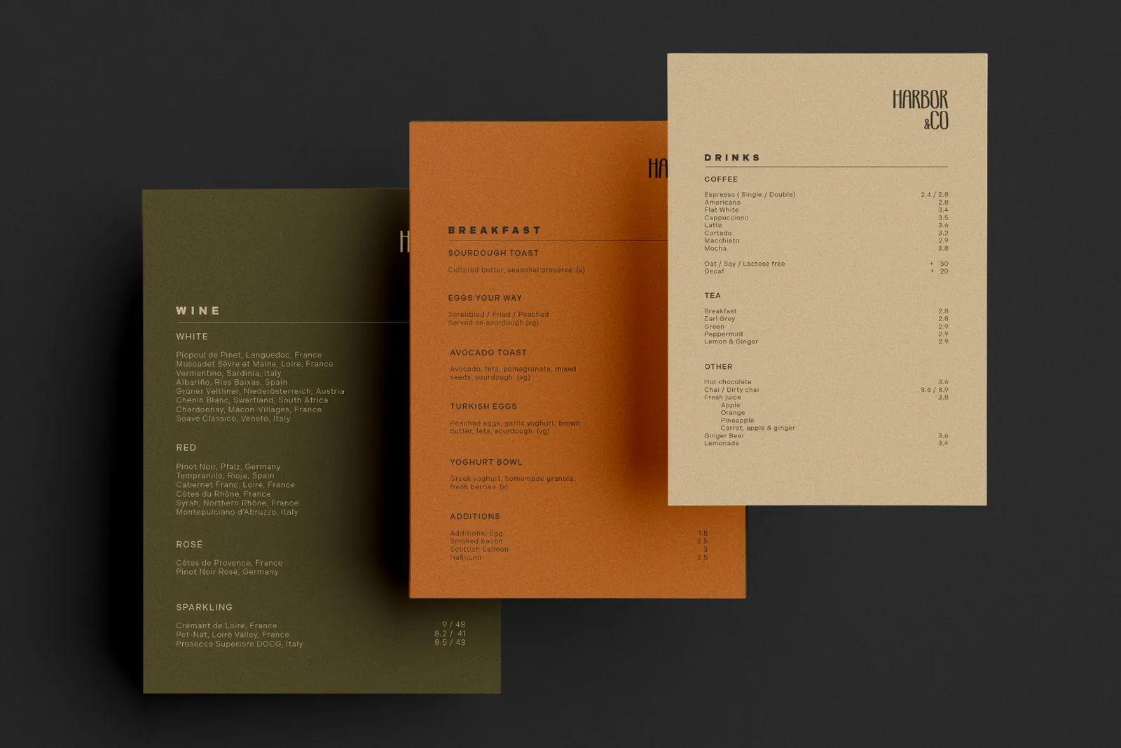
- Menu (day / evening)
- Social media layout system
Deliverables
- Final logo / wordmark
- Defined typographic hierarchy
- Colour palette with usage guidance
- Layout rules and grid examples
- 2–3 brand applications
- Portfolio-ready case study
Constraints & Success Criteria
Constraints
- Typography-led identity
- Limited colour palette
- No illustration-heavy branding
- Focus on clarity, spacing, and hierarchy
- Identity must work well in print
Success Criteria
- The brand feels calm and confident
- Typography and layout do most of the work
- The system feels flexible but consistent
- Applications feel cohesive across touchpoints
- The identity feels appropriate for a physical space
We don't want something that feels designed for Instagram first. It should feel good in the space, in print, and in use. Note from client
02
Design Direction
Design Intent
The venue is a space where thoughtful conversation naturally takes place, and the brand should reflect that atmosphere. The identity should be minimal and restrained without feeling cold or empty. Typography will play a central role, supported by generous negative space and a calm, editorial rhythm.
Rather than competing for attention, the brand is quietly self-assured. It does not call out to passersby, but instead invites curiosity. The kind of place someone notices in passing and thinks, "That looks considered. Let's step inside."
Core Concept
A brand system inspired by its origin, a harbour-side warehouse, well structured and established. The identity balances clarity and order with warmth and familiarity, creating a sense of permanence and quiet comfort.
Principles
Layout & Spacing
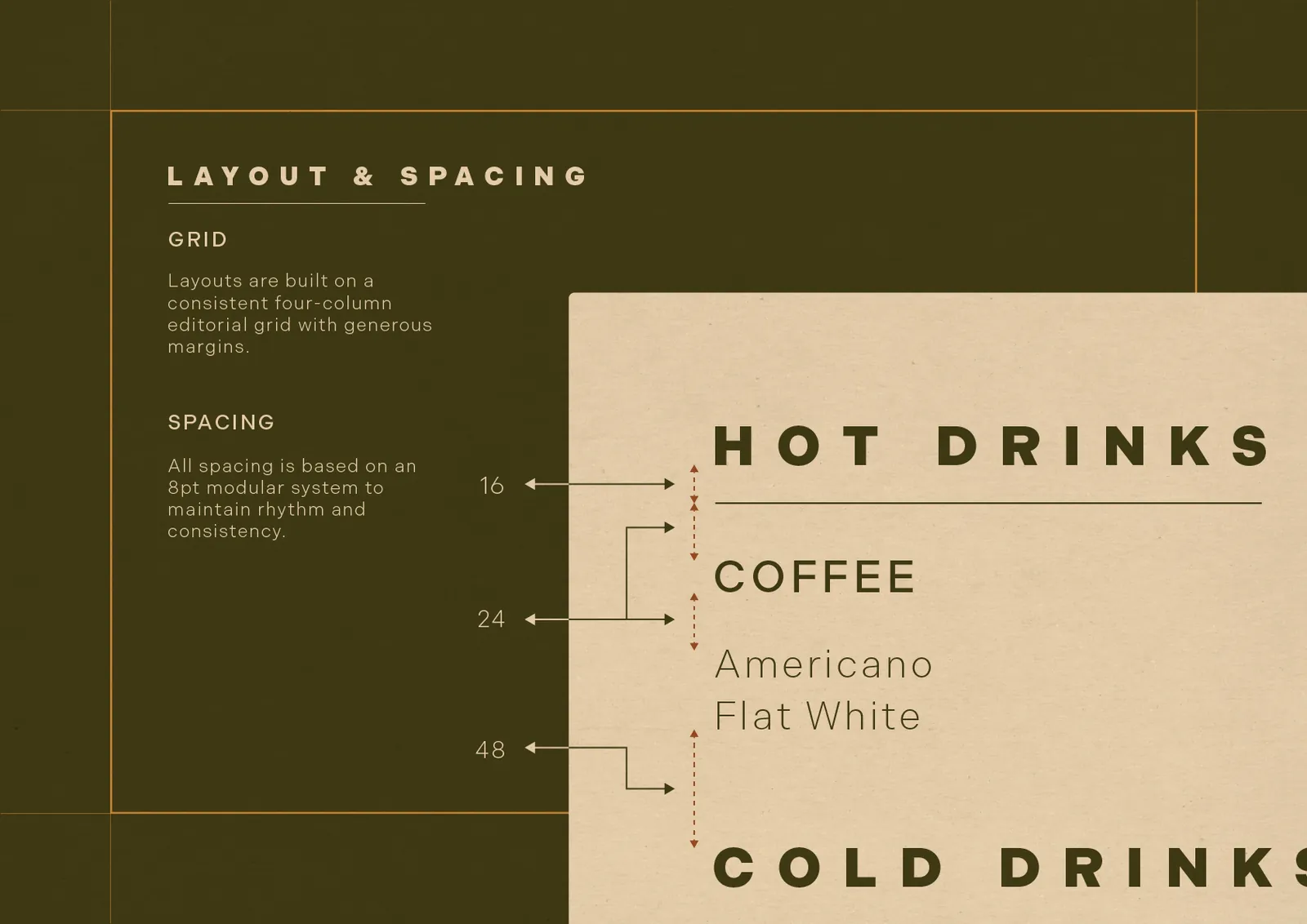
Layouts should feel calm and deliberate, using generous margins to give content space to breathe. Content is intentionally minimal and carefully placed, guiding the viewer's attention without distraction. Spacing creates clarity and rhythm, ensuring layouts feel composed rather than crowded.
Colour
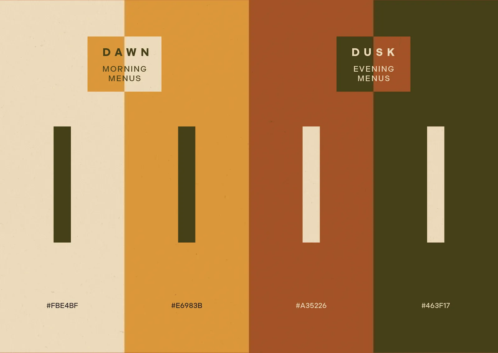
The palette is warm and neutral, drawing from soft oranges and muted browns to create comfort and familiarity. Saturated colours are deliberately avoided in favour of restraint. Cooler hues such as greens and blues are excluded, keeping the palette calm and free from cold associations.
Typography
Typography should feel clean, intentional, and quietly confident, avoiding over-designed or decorative treatments. Letterforms have generous spacing, allowing the type to breathe. Lighter weights are preferred, supporting hierarchy without visual heaviness.
Design Principles
Restraint over expression
Design only what is necessary.
Clear hierarchy
Structure always leads the eye.
Systematic grids
Consistency through structure.
Generous white space
Space is an active element.
Tone, Positioning & Application
Tone & Voice
Communication is direct and clear, favouring intent over promotion. Language is calm and considered, helping customers feel informed and comfortable without feeling patronised or overwhelmed.
Brand Positioning
The brand is intentionally understated: structured, consistent, and self-assured. It avoids visual noise and promotional urgency, presenting a venue that feels established and quietly in demand rather than attention-seeking.
Application Mindset
The identity is designed primarily for print and physical formats. While not entirely print-focused, selected digital applications support social content where appropriate. Scale and legibility are prioritised over animation and visual effects.
Success Measures
- If the brand feels confident without explanation, it is successful
- If the brand feels refined without appearing pretentious, it is successful
- If the brand remains legible while visually engaging, it is successful
03
Research & Visual Direction
Typography
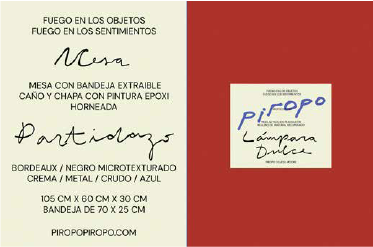
Piropo
- Handwritten typography gives off a comforting familiar vibe
- Paired with legible sans serif can produce an appealing design based on the contrasting types.
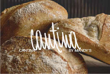
Cantina
- Rustic, grainy and handwritten type is casual - not trying too hard.
- Again paired with a simple sans serif is effective for being familiar but also practical.
Layout & Grid
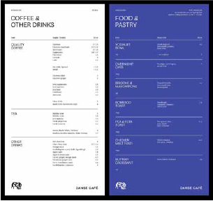
Danse Cafe
- Majority of page is negative space giving the menu room to breathe.
- The headers taking up 1/2 of the page makes it very clear to see what section is what.
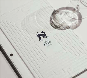
Arts & Crafts
- Interesting pattern to make a maze type design on the menu.
- Embossed so that it doesn't add to the existing colour palette.
- Menu follows same maze/grid like structure adding interest to the design.
Colour
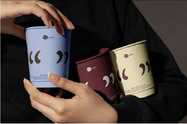
Hi Coffee
- Minimal colour palette works well because none of the colours are fighting for attention.
- Two warm colours with high contrast could work on their own.
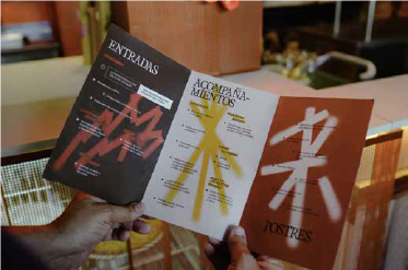
Fuegos
- Great colours, muted, rustic and warm.
- Provides comfort whilst also having enough contrast to be legible.
Hierarchy & Spacing
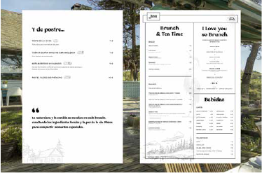
Avrile
- Hierarchy on the left menu is perfect. You read everything in the order you are supposed to.
- The right menu has too much going on, too many things fighting for attention.
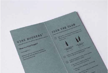
Sixty Vines
- Lots of vertical spacing between content, almost an exaggerated amount providing room for content to breathe.
- Good use of font weight combined with font size to guide reader.
Results
- White space is used as structure, not design.
- Colours are muted but also highly contrasted to maintain legibility.
- Headings are understated without being lost in the design, this keeps a minimal look.
- Handwritten/rustic typography matches very well with simple sans serif.
- Provide lots of vertical spacing. This gives content room to breathe.
Dos & Don'ts
- Don't add unnecessary designs. This will clutter and create a busy overall design.
- Do add plenty of negative space. The majority of the design should be intentionally minimal.
- Don't use more than three colours. The design shouldn't be shouting for attention.
- Do use fairly large gaps in-between letters. This shows the reader you are not trying to overload them with information.
Brand Positioning
The visual direction is warm, restrained, and quietly confident. Typography combines rustic, handwritten styles with a simple sans serif to create a sense of familiarity while remaining highly legible and practical. Layouts prioritise negative space, using white space as a structural tool rather than decoration, allowing content to breathe and remain clear. Hierarchy is intentional and calm, guiding the reader naturally without competing elements. Colour palettes are minimal and muted, relying on contrast rather than vibrancy to maintain readability. Overall, the system avoids unnecessary embellishment, favouring clarity, comfort, and considered simplicity.
04
Design Process
This section documents the exploratory phase of the Harbor & Co. identity, outlining how key visual decisions were tested, evaluated, and refined.
Typography
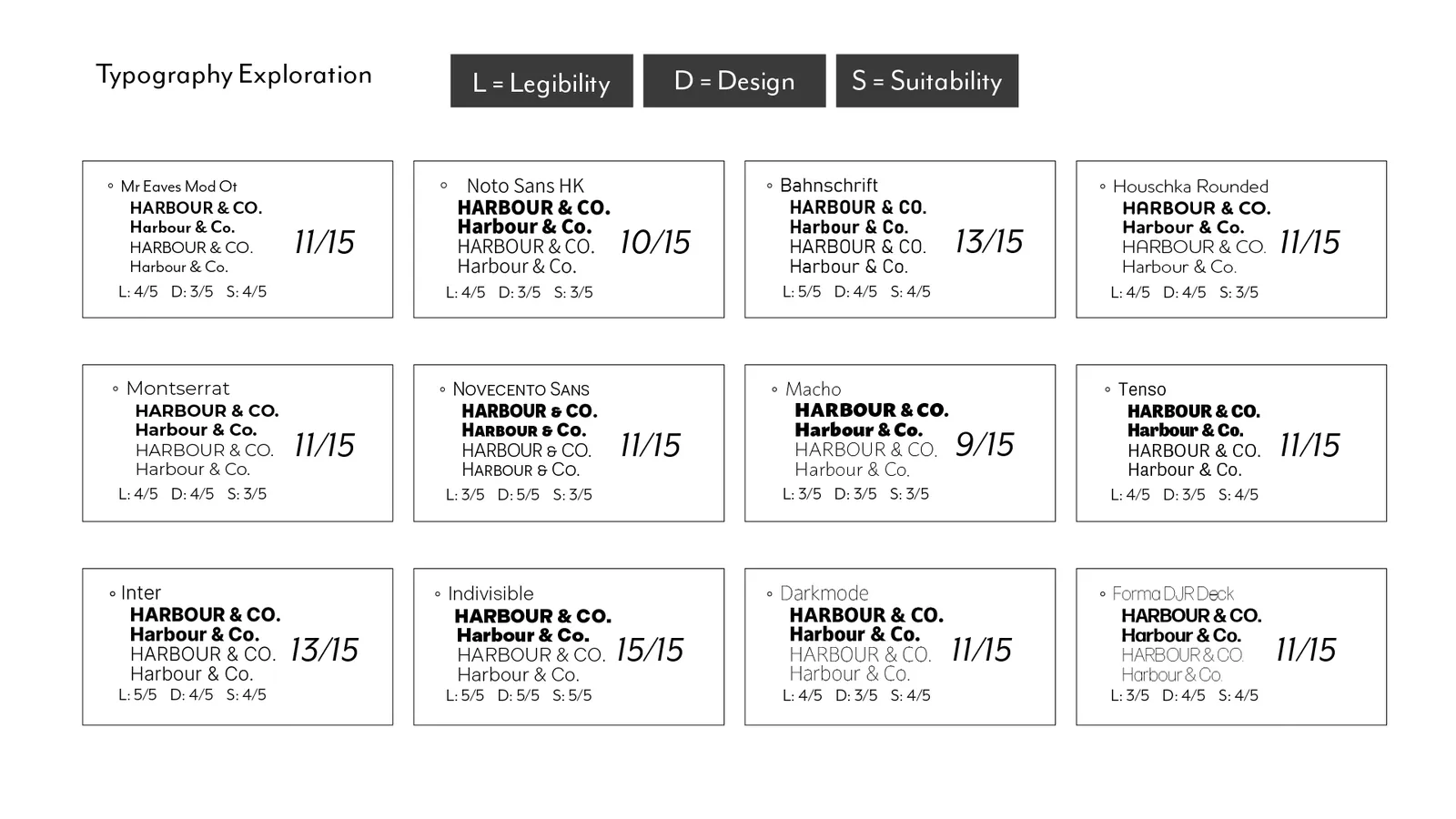
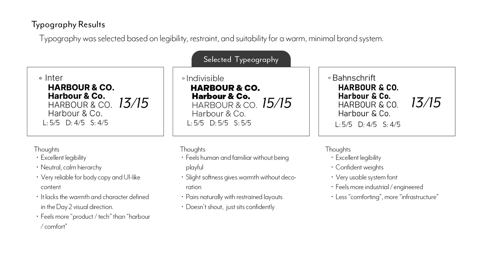
Exploration focused on legibility, hierarchy, and long term usability. A range of typefaces was assessed against clarity, tone, and restraint, ensuring the final selection supports a calm reading experience and functions reliably across both print and digital applications.
Logomark
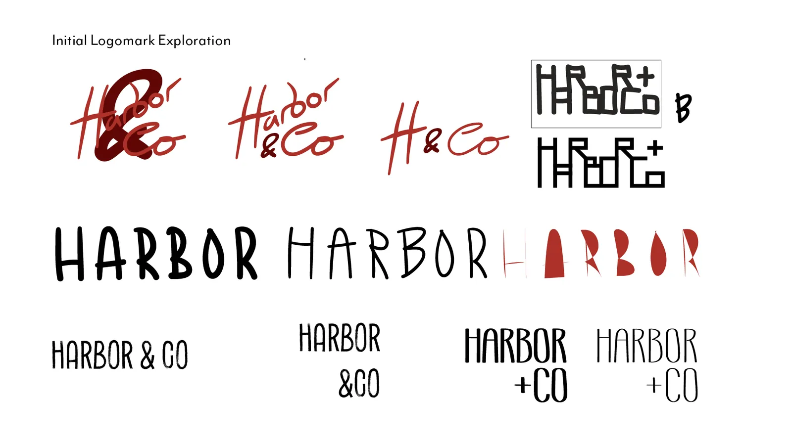
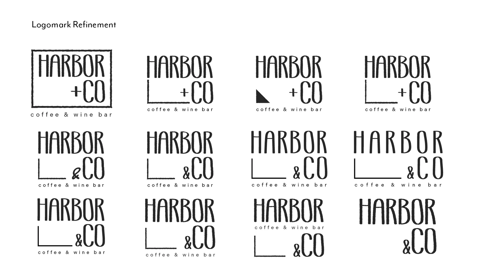
Development progressed from loose, expressive sketches into a more structured and scalable system. Emphasis was placed on proportion, balance, and consistency, allowing the mark to remain confident and recognisable across a variety of contexts and sizes.
Colour
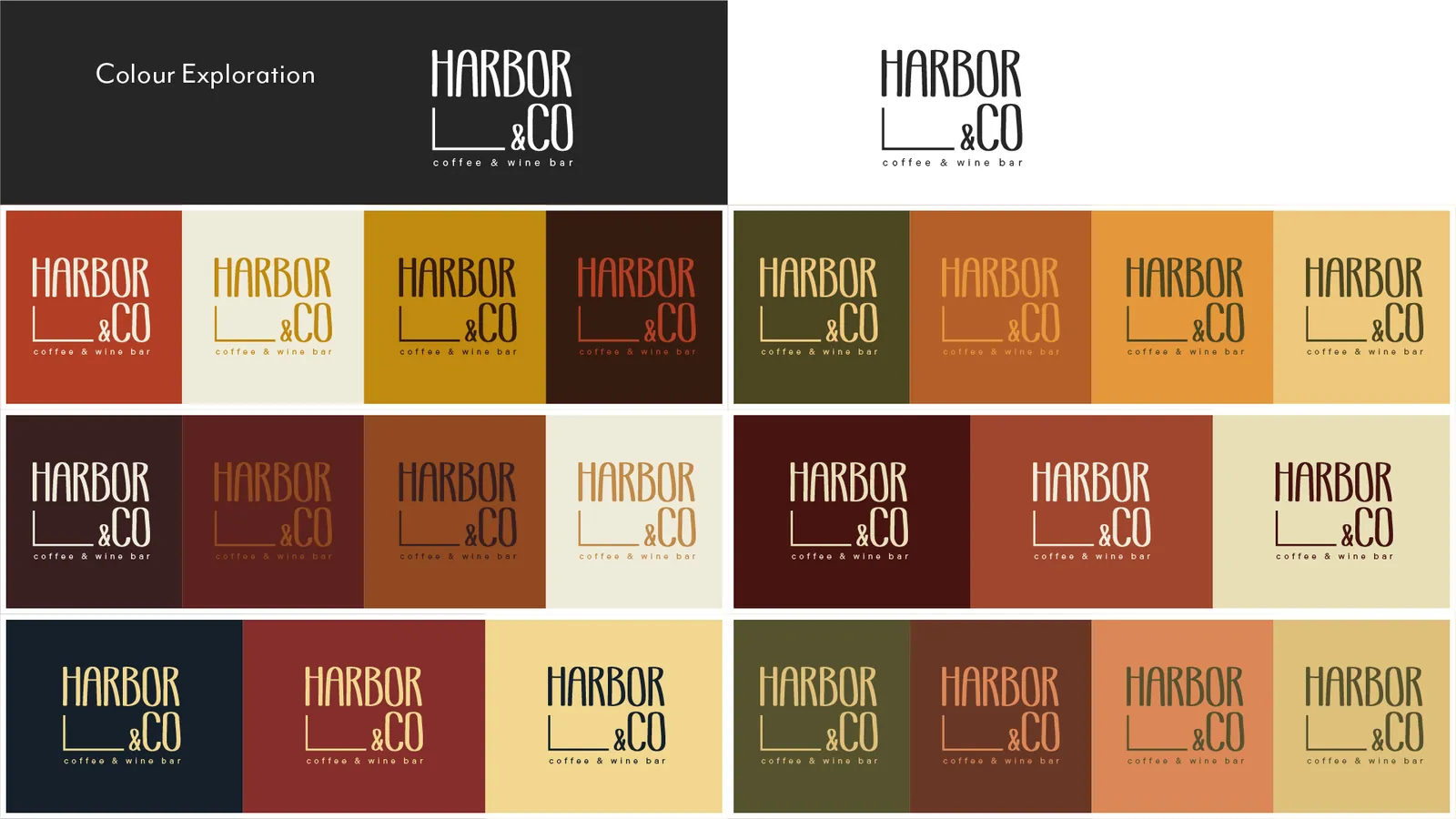
Palettes were explored across a range of warm, restrained tones and tested using contrast checking tools to ensure sufficient accessibility. This helped balance visual warmth with clarity, keeping the palette usable rather than decorative or trend-led.
Typography Analysis & Conclusion
Logomark Design Process
Colour Exploration & Finalising
05
Core Visual Identity
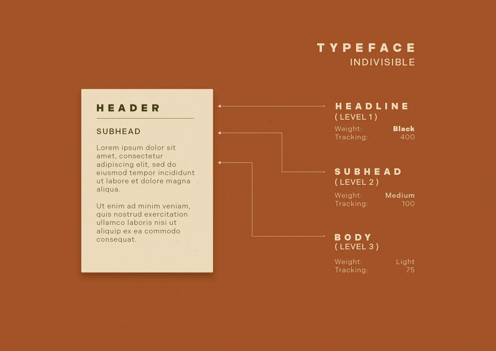
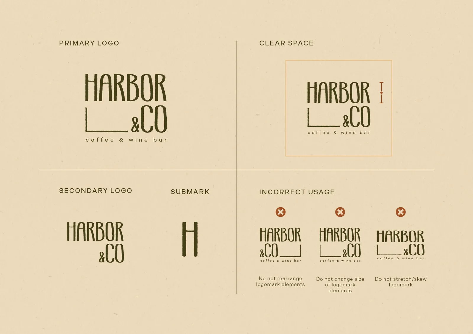
This section captures the thinking behind the Harbor & Co. identity. Typography, logomark structure, and colour were explored through testing and refinement, allowing each element to settle into place rather than be over-designed.
The outcomes of this process informed the final visual system, which is presented in the following section.
06
Mockups
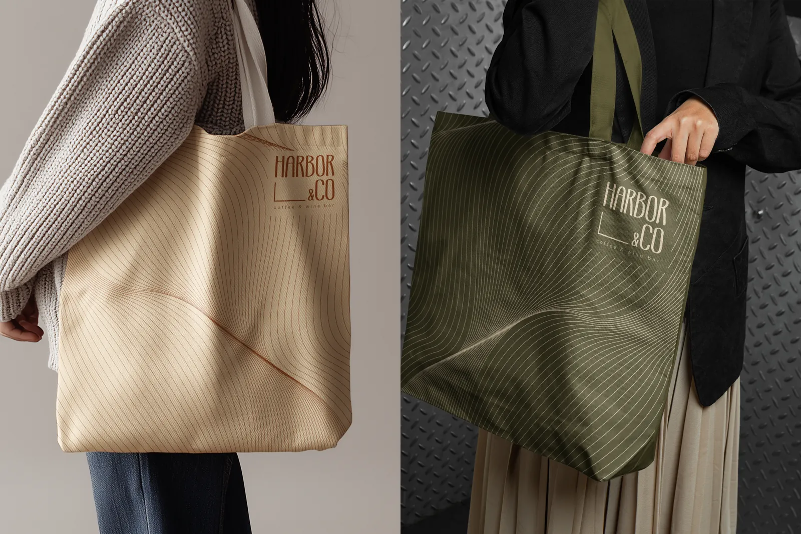
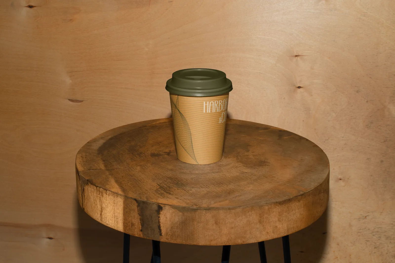
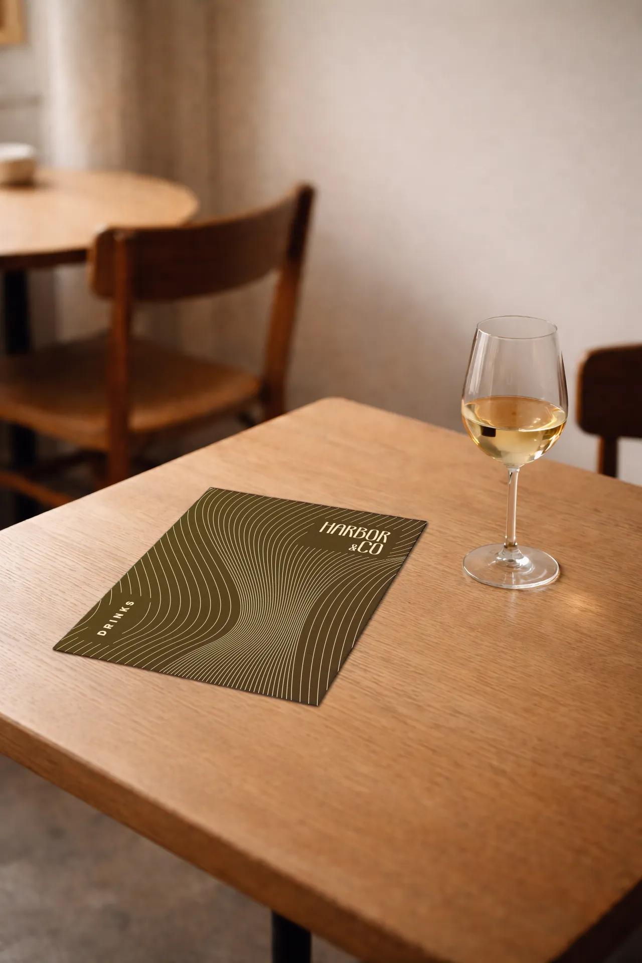
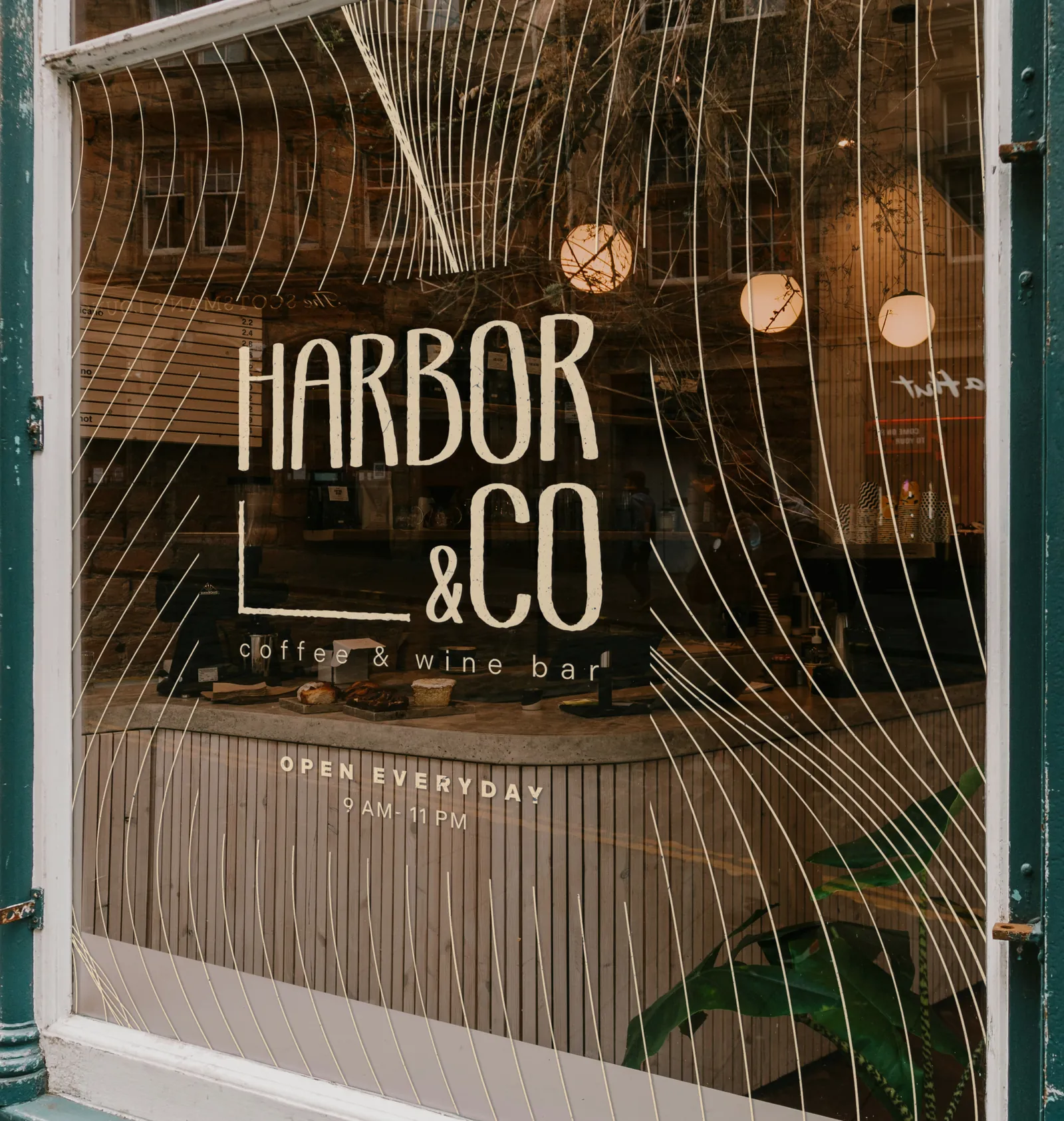
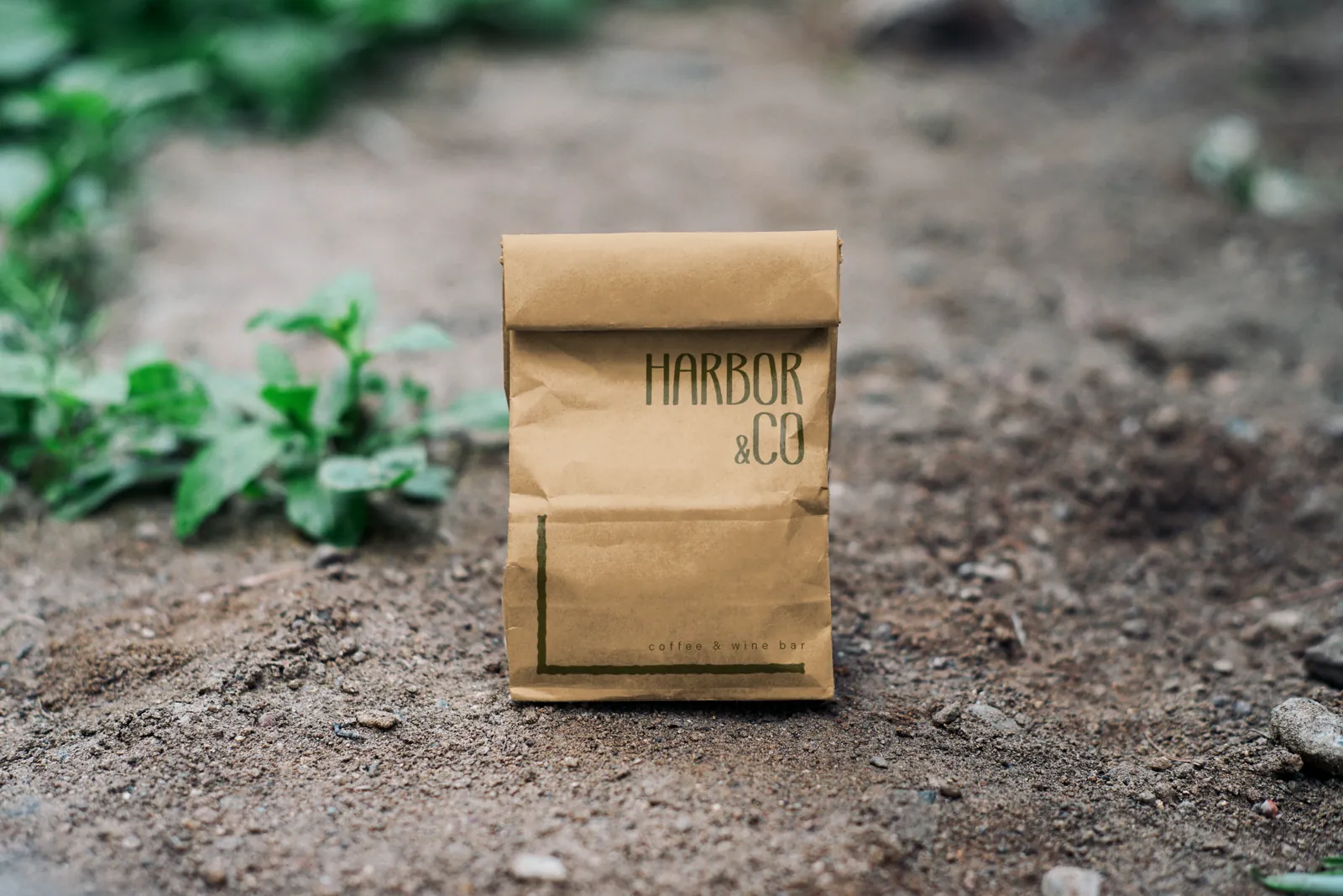
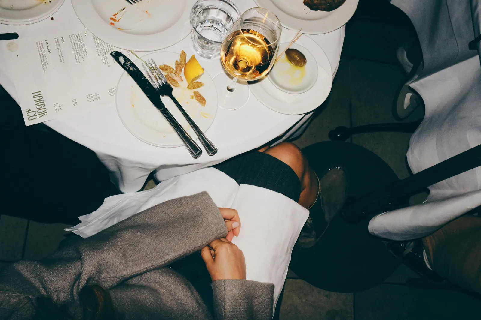
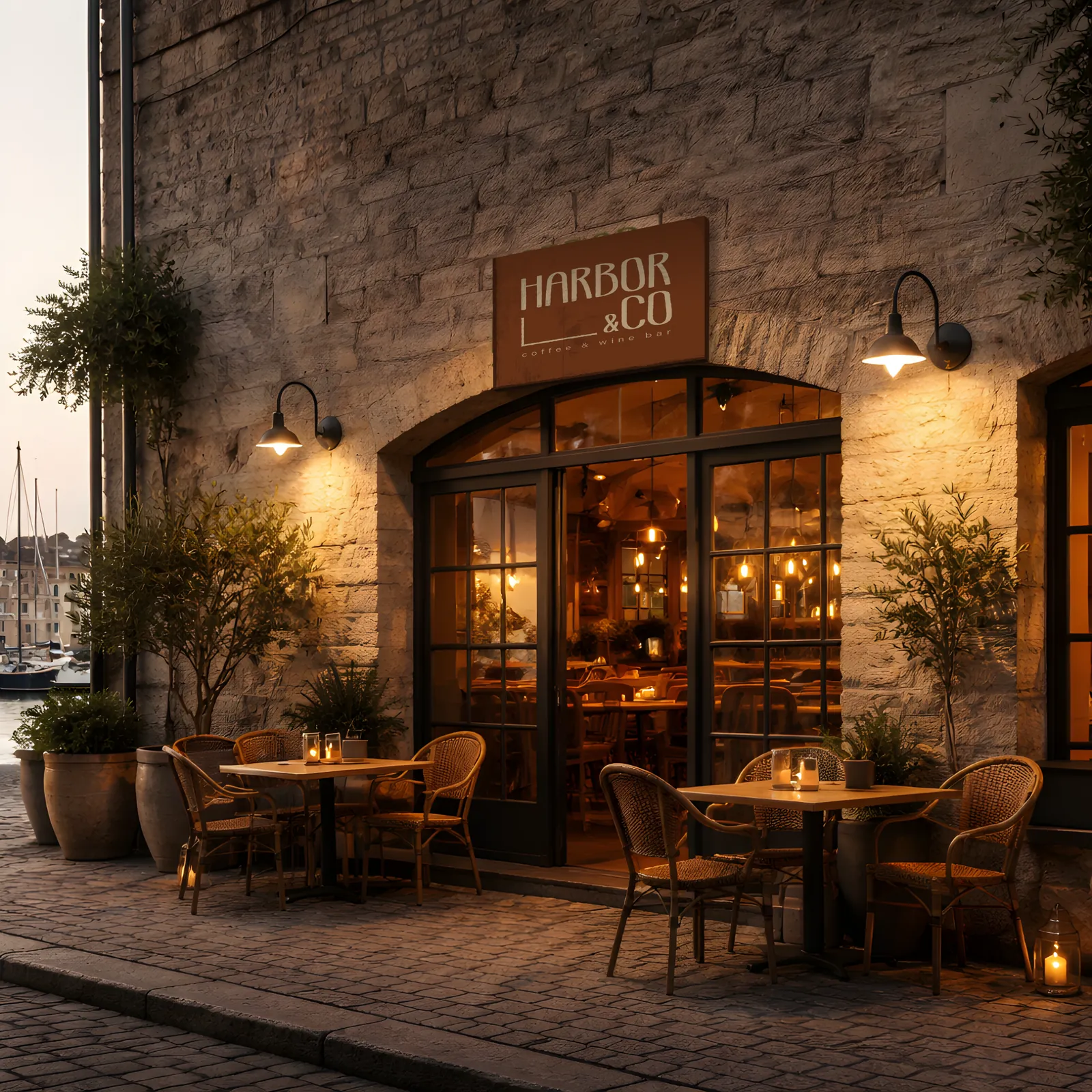
A selection of brand applications showing the identity across signage, packaging, menus, and social layouts.
07
Conclusion
This project allowed me to slow down and focus on designing with intention. Rather than starting with visual ideas, I concentrated on structure, hierarchy, and tone, allowing the identity to emerge through testing and refinement rather than decoration.
Working on Harbor & Co. reinforced the value of typography-led systems and the impact of restraint. By prioritising legibility, spacing, and clarity, I was able to create a brand that feels warm without being expressive, and confident without being loud. Testing colour through contrast and application helped ground the visual direction in usability rather than preference.
The final identity reflects the kind of work I aim to produce. Thoughtful, calm, and rooted in purpose. A system designed to function naturally in both physical and digital spaces, and one that is built to last rather than impress momentarily.
Next
Harbor & Co. is a self-directed brand project: no client, no brief but my own, and the place I worked out how much of an identity can be carried by type alone. The rest of the work, including the client builds it fed into, is on the projects page.